Tagdata

2018 Winter Data Analytics Competition – MCM

I took a brief break from working on side projects to participate in the MCM (Mathematical Contest in Modeling) competition. I decided to compete in this competition mainly after enjoying and seeing success in the previous semester’s GDMS data analytics competition (post linked here) in which my team received an honorable mention in the beginner’s division. Again, my team consisted of friends Kali Liang (CMDA major) and Eric Fu (BIT major). Looking back on both of these competitions, I would definitely say the diversity in majors really helped in our ability to come together and perform, mainly due to our differences in perspective when it came to looking at the problem as a whole. Similar to the previous competition, we were given a .csv file with about 600 categories involving energy consumption and production rates per year in Arizona, California, New Mexico, and Texas, and were asked to come up with energy profiles for each state and to predict energy consumption and production in 2025 and 2050, all in the context of using cleaner energy sources. For reference, we tackled problem C (all problems linked here).

We used a mixture of VBA (Excel), Python, and R to analyze the given data. My main job was to determine which subsets of data were interesting and useful and to plot them using Python/matplotlib.

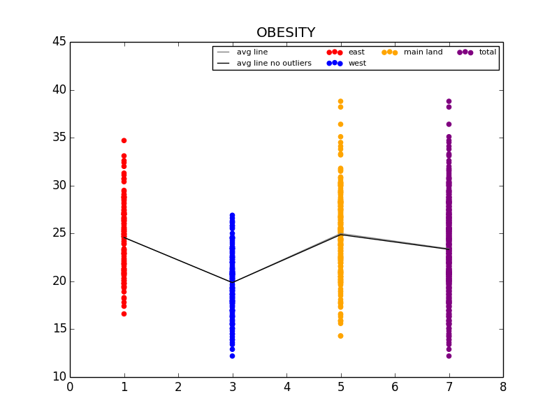
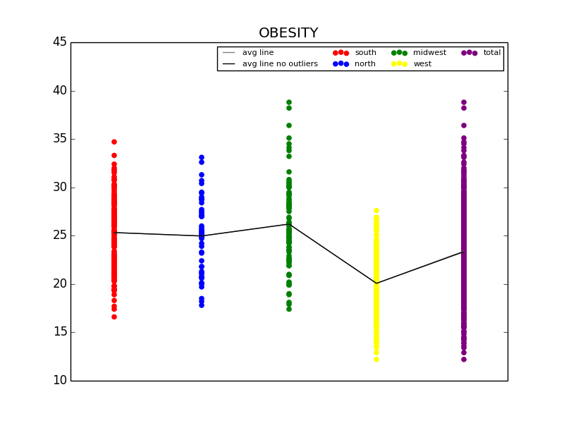
Moving on to the actual data analysis, we started by creating energy profiles for each of the four given states. We split our profiles into 3 graphs we deemed relevant, including overall energy consumption, overall energy production, and energy usage by sector in each state. The main hurdle for this section was deciding how to cut down the data to where each graph wouldn’t be too cluttered but the data would still be accurate enough to use. For instance, for energy consumption alone, each state’s initial graph had over 20 sub-plots, making the graph hard to read at first glance. This was due to the inclusion of ultimately insignificant values (for instance wood and waste energy consumption). As a result, we cut these insignificant sub-sets, facilitating visual analysis on each graph. The downside to this was not having a fully accurate representation of total consumption and production in each state, but we decided the sacrifice was worth it for the visual clarity provided. az_profile_cons.png
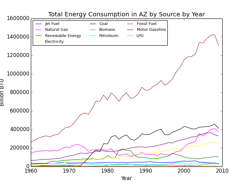
Energy consumption graph for Arizona. You can see that as the Y values approach 0, the higher the concentration of plot points (and this is after cutting more than 10 sub-sets).

Next, we moved onto attempting to define a more accurate illustration of the data set in regards to the context of the problem, renewable energy usage. We decided the best way to do this was to put everything in terms of the estimated amount of pollution each state was producing per year. We determined this value for each state per year by calculating the summation of each states energy consumption value multiplied by the transfer rate between that specific energy type and CO2 emissions. Essentially, we arranged Jet Fuel, Natural Gas, Coal, Petroleum, Motor Gasoline, and LPG consumptions per year in a single-column matrix and found its dot product with a constant single-column matrix that consisted of the conversion coefficients for that specific energy type and CO2 emissions, labeled C in the graphic below. We determined the conversion coefficients by pulling data from the EIA (here).

Screen Shot 2018-02-19 at 2.08.00 PM.png

Screen Shot 2018-02-19 at 2.09.34 PM.png
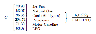
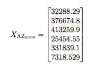
Excerpt from our final paper detailing the values of the C conversion constant and giving Arizona’s numbers for 2009.

Using the information above (Note: the structure of X_AZ follows that of C (in order of energy type from top to bottom, given in billion BTU. A conversion factor of 1000 Mill BTU / 1 Bill BTU was added) we are able to calculate an estimation of the CO2 emissions in Arizona in 2009 (X_AZ_2009 * C = 93307874.83 metric tons of CO2. Given the population of Arizona in 2009, we can then determine an estimation of CO2 emissions per capita of Arizona in 2009 (abt. 14 metric tons of C02 per capita). We then generalized this process in order to create a graph of CO2 emissions in each state per year.

total_c02_capita.png
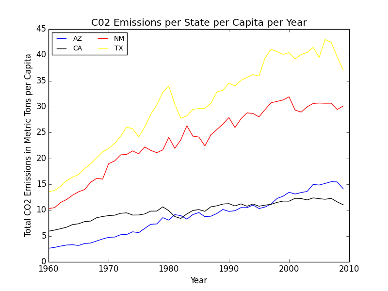
Graph detailing CO2 emissions per capita per year in each of the states. We used this information to generally rank each state in terms of pollution production, in order to circle back and create a discussion surrounding using cleaner energy sources.

Next came predicting energy consumption/production in 2025 in the context of cleaner energy usage. For this, as we began to run out of time (we only had four days for this competition) we resorted to using a basic linear regression to predict the values for 2025 and 2050. The main notable conclusion from this experiment was seeing how high energy consumption values were predicted to become, especially in regards to the very rapidly increasing CO2 emissions per capita for each state. As an example, total energy consumption in Arizona, using the linear regression model, was projected to increase by over 800,000 BTU. This, paired with the estimated increase in CO2 emissions per capita of abt. 5 metric tons per capita shows just how quickly pollution is projected to get out of control. Of the four states, Texas had the worst CO2 emission rates per capita estimated by 2050, seeing an increase of 37 metric tons per capita from 2009 (a projected value of abt 76 metric tons per capita). Again, we used these values to stress the importance of switching to more renewable energy sources in the coming years, before damage becomes irreversible.

Using all of the above data, we discussed in our conclusion the importance of moving away from commonly-used, bad for the environment energy sources. With the exponential increase in population in all of these states and really throughout the world, energy consumption and production has understandably seen a drastic increase in recent years. However, with the threat of global warming, each state needs to do whatever it can in order to slow or even reverse the effects brought on by these increased consumption and production rates.

I’m incredibly thankful to have competed in the GDMS competition prior to this competition, because without prior experience, we definitely would have had no idea where to start and probably would not have finished on time (of which we only barely did given the work detailed above, after making a numerous amount of assumptions ultimately weakening our argument). All in all, this competition was equally taxing on our mental health as it was fun to compete in. We look forward to participating in future data analysis competitions in the future. Unfortunately, we don’t hear back about the results until some time in April. If you want to see our final paper (written in LaTeX) in detail, you can find it here.

2017 Fall Data Analytics Competition – VT/GDMS Health in the US

Moving into the fall semester of my Sophomore year at Virginia Tech, I was a little starved of side projects I could do, simply due to the amount of schoolwork I had to finish each week. However, luckily I was able to make time for a couple projects I could focus on in the side. One of them being is data analytics competition, of which was sponsored by the CMDA club here at VT and GDMS. I participated in the beginners competition in a group of 3, the other members being good friends of mine Eric Fu and Kali Liang. In the competition, we were given a large data set (.csv file) involving health issues across various cities throughout the United States (500 entries). Some examples of the categories, just to get a feel of the type of data we received, included ailments such as asthma, obesity, heart disease, kidney disease, etc. We were also given general data involving disease prevention (i.e. access to health care, going to regular checkups, etc.) and unhealthy behaviors (i.e. binge drinking, drug use, lack of leisure time and sleep, etc.).

I believe that my group’s approach to the data was a rather unique one, given our different backgrounds. Eric is a BIT major, Kali is a CMDA (Computational Modeling and Data Analytics) and Statistics major, and I am, of course, a Computer Science major. As a result of our different backgrounds, we each had different ideas as to how to approach the information to find correlations between the categories. For instance, my approach was to code basic programs in Python using numpy and matplotlib to generate scatterplots and other useful graphs, while Kali was comfortable using R to find more statistics-heavy information (like GLM/LS Means) and Eric was comfortable working directly in the given Excel file to look for correlations.

First, we decided as a group to look for interesting differences in the data by splitting the it up into regions. We explored a number of splits, and we ended up using data from a regional split (NE, S, MW, W), a coastal split (west/east coast, with everything else being lumped into a “main land” group), and a split based on population size to explore the uniqueness of big cities (we defined a big city as any city above 2 standard deviations above the mean population for the entire data set). We also explored a split based on State, but found the data to be too volatile, and with 51 groups (incl. Washington DC), there were still too many points to investigate. My python scripts came into good use here, as I was able to make a quick program that found and graphed the scatterplots of each region for any given category, along with a line that connected the means for each sub group together (with and without outliers) for visual investigation. I also coded a script that plotted scatter plots for any 2 given categories to see if they were related.

OBESITY.pngOBESITY.png

The first graph details the difference in Obesity in the east vs. west coast, while the second illustrates the difference in Obesity in the US Regions.

From this initial stab at the data, we found what we believed to be significant differences between the general health in the east coast and the west coast (meaning the west coast was significantly lower than the east in almost all categories). Also worth noting, we also determined that health in the west region was generally better than the other regions. From this lead, we explored the differences in the means to attempt to understand why the west is generally healthier. We observed that both the west coast and the west region have significantly lower Obesity rates when compared to other regions, and decided to explore that as a possibility (see the mean comparison charts above). We confirmed our assumption by looking at the general trends for obesity and various other ailments and observed that, in general, there is a strong link between obesity and other serious health problems.

figure_1.pngfigure_1.png

Some of the scatterplots we used to illustrate the link between Obesity and other serious illnesses like heart disease (CHD) and asthma (CASTHMA). 

In order to further provide evidence for our assumptions, Kali used regression analysis, specifically generalized linear models with least square means to further look for significance between these groups. Using these tests was helpful because it not only aided at eliminating some of the confounding variables that may be lurking within the data, but made it extremely clear as to whether the data was significant or not through looking at the p-value numerically and with a visual aide. Essentially, when graphed, intervals of the mean are plotted for each region (each interval determined using a 95% CI). If the regions don’t have any overlapping points, then the difference between the two can be considered significant and is definitely worth looking into. As you can see below, we were able to confirm our assumption that the difference between obesity rates in the east and west is significant.

Picture1.png

LSM Chart confirming our assumption that the difference in Obesity rates in the east and west coasts is significant

However, we were not satisfied simply stating that we recommend that Obesity rates be lowered, so we looked into possible variables that could affect Obesity that weren’t already included in our data set. Ideas for this included finding density of fast food restaurants within each city, and measuring the nutritional differences between each city. Unfortunately, we were unable to find any reliable data on density of fast food restaurants, but we were able to pull data from the CDC website pertaining to amount of people that ate less than one fruit and one vegetable per state in the US. Using this data, we first confirmed the link between not eating nutritional food and obesity, then went on to make our recommendation. Eric’s background in Business came in handy, as we gave various recommendations that made sense from an economics point of view (i.e. decrease the tax or cost of fruits and vegetables in obese regions, subsidize farmers to increase fruit and vegetable output, or push advertisements encouraging people to eat healthier).

As a slight aside to our main focus on Obesity across the US, we also found that Stress (we defined stress as a lack of leisure time (LPA) and a lack of sleep) was high in big cities. We noticed that not only were kidney problems slightly higher in bigger cities, but so were other ailments such as strokes and diabetes. We were able to link the connection between stress and diabetes with kidney problems (seen below), and further connect kidney problems with strokes. Unfortunately, due to the time constraints for the competition, we were not able to explore these connections much deeper. However, given more time, we definitely would have done so.

SLEEP.pngfigure_1.png

Mean comparison showing increase in lack of sleep in big cities and scatterplot showing the relationship between sleep deprivation and kidney problems.

This competition was extremely fun to participate in. Unfortunately, we did not place in the top 3 teams for our section, although we did get an honorable mention. I want to thank GDMS and the CMDA club at VT for making this a reality. I’ve always been interested in data analytics due to my background in neural networks, and it was incredibly fun to work on something data analytics related even though I haven’t been able to take any statistics courses as of yet.

If you’d like to see any more plots, or would like to see the scripts I made for the purpose of this competition, feel free to email me at [email protected].

© 2024 Brendan McCloskey

Theme by Anders NorénUp ↑